Frictionless Data is a project at Open Knowledge International (OKI), a combination of technical specifications, and informative articles, aimed at making it as easy as possible to transport data between different tools. OKI is a global non-profit organisation, playing an instrumental role in demonstrating the value of open data, and in building tools to facilitate its use.
At the time of commencing this work, Frictionless Data was a fairly new project, but was starting to amass quite a lot of content. Two websites had been put up, as a reaction to needing to publish two types of content. One contained project information, and articles, the other technical specifications. Though some of this content was aimed at different audiences, it was preferable to have it all accessible from a single location. The people responsible for publishing content were from coding backgrounds, were hosting the content on GitHub, and happy to continue to do so. Projects at OKI each have their own brand, so a logo and visual identity were also required here.

A logo and colour palette were designed to give the project its own strong identity. The orange colour was chosen to be unique in the OKI portfolio of projects, while also sitting comfortably along side other projects. A range of dark greys were added to provide a strong contrast. An icon style was also developed.
The typeface was selected for its geometric, but humanist look, offering a modern feel, but not devoid of character. It was important that the font have a large family of weights, to offer flexibility when it came to presenting different types of content. A serif font was also used to aid reading of longer texts.
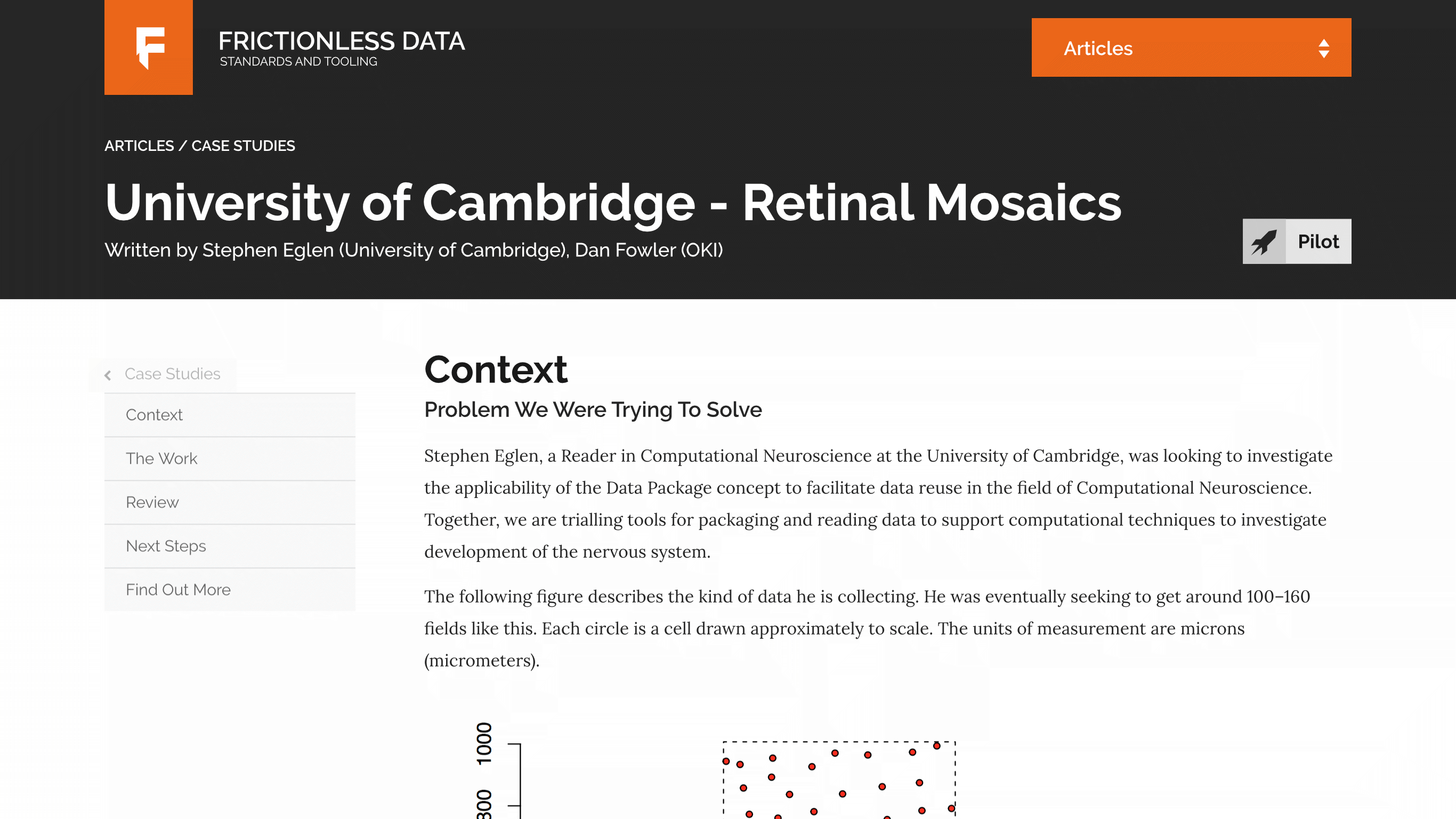
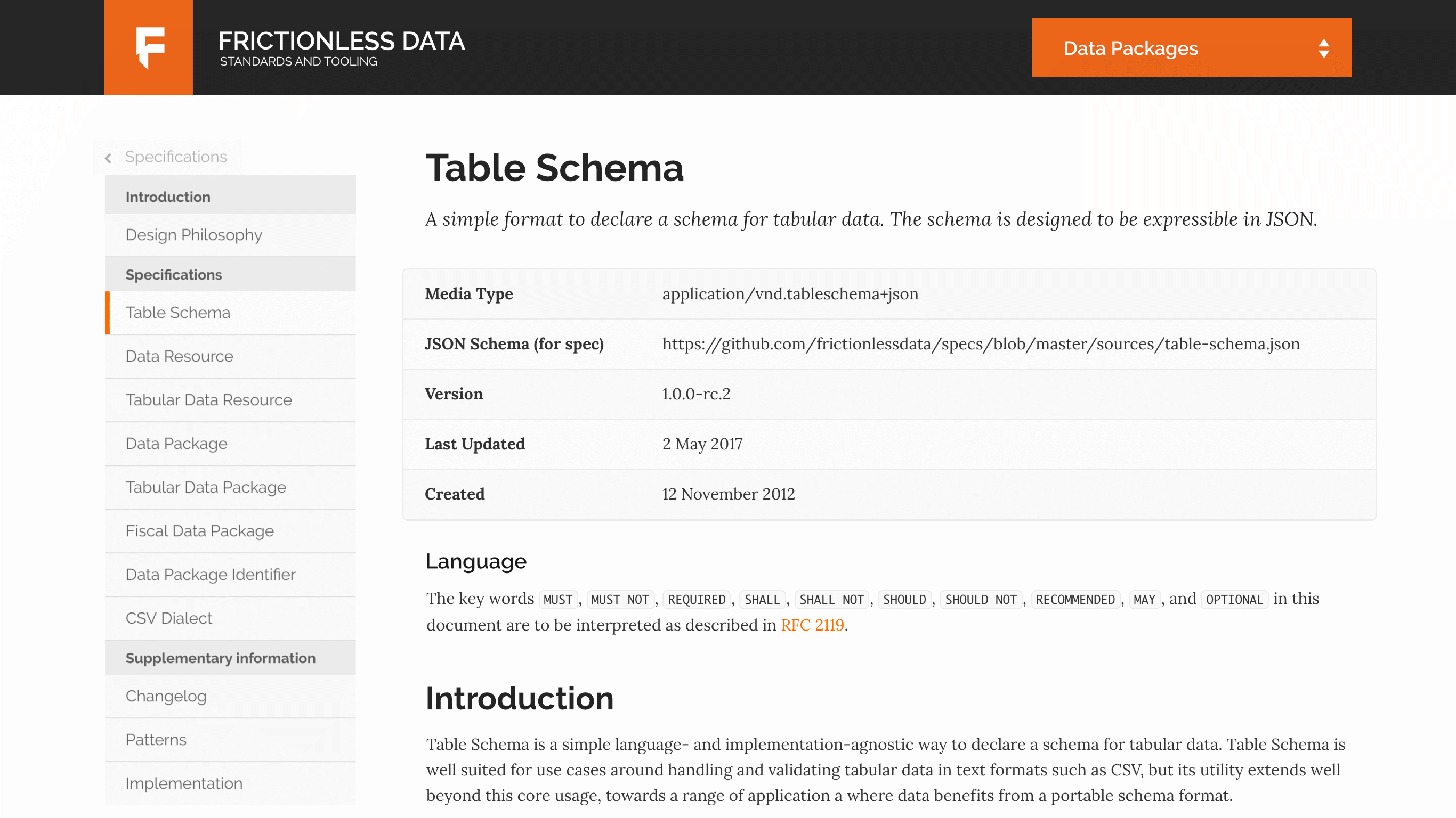
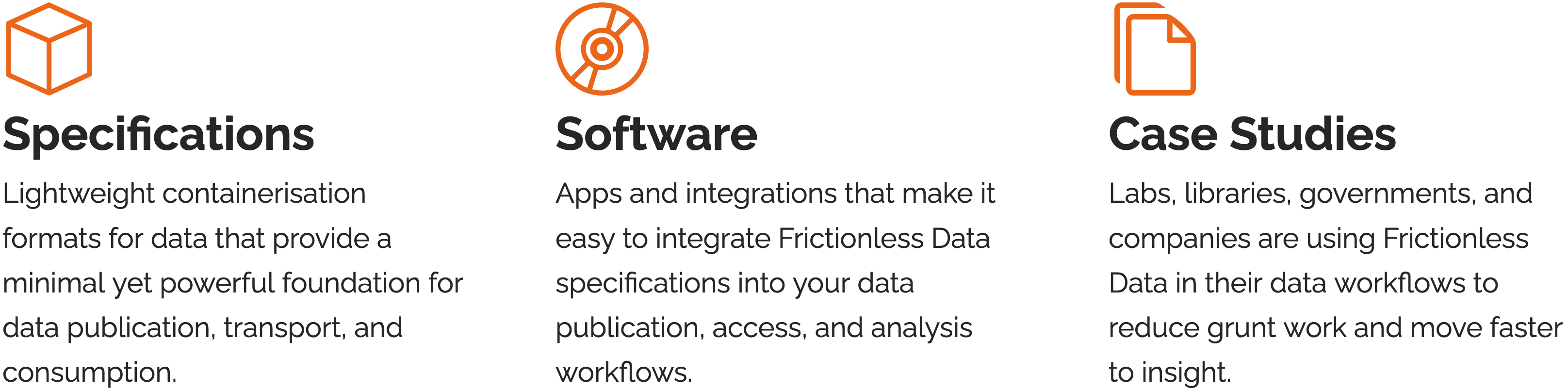
Articles and technical specifications formed the majority of the content at this time. Similar layouts were used, but the addition of a the grey banner at the top of the article template helped differentiate the two. You can also see at a glance what top-level section you are in via the menu drop-down at the top right of the page. This was a new design pattern I created for this project, intended to be a happy medium between fully visible navigation, and completely hidden fly-out navigation.
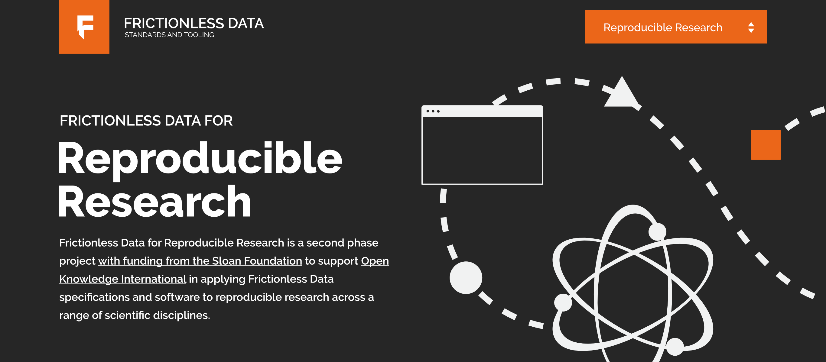
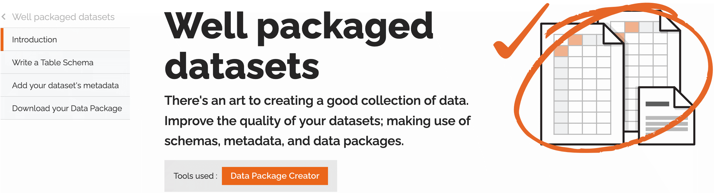
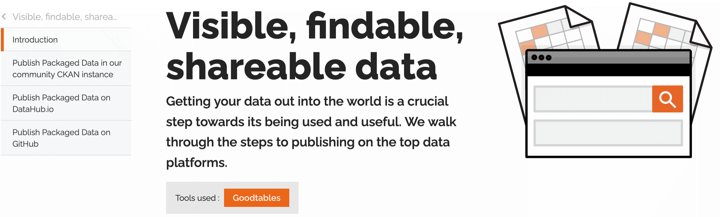
As the project was in progress, other cases for types of content, that could be abstracted into templates, started to emerge. One of which was a standalone introduction or overview of a topic area, such as Reproducible research. In this case, a much more prominent banner was utilised, to mark out the page as an entry point, or landing page for a specific area of interest. This is one of the areas where illustration became a key component. I developed an illustration style, which I used here and elsewhere in the project.
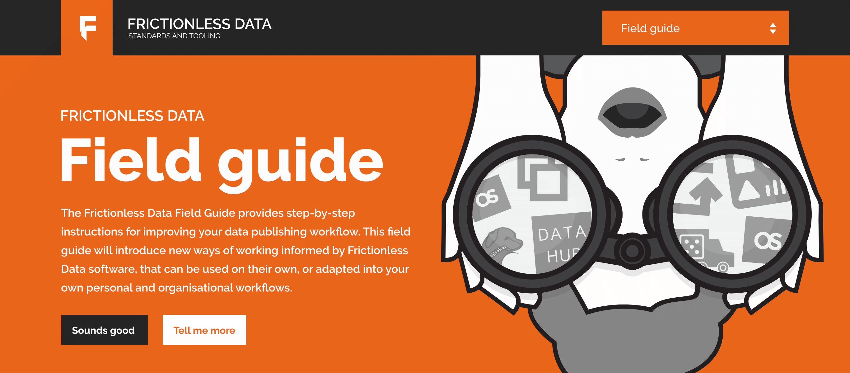
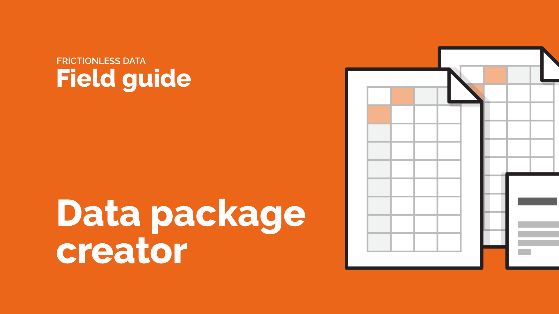
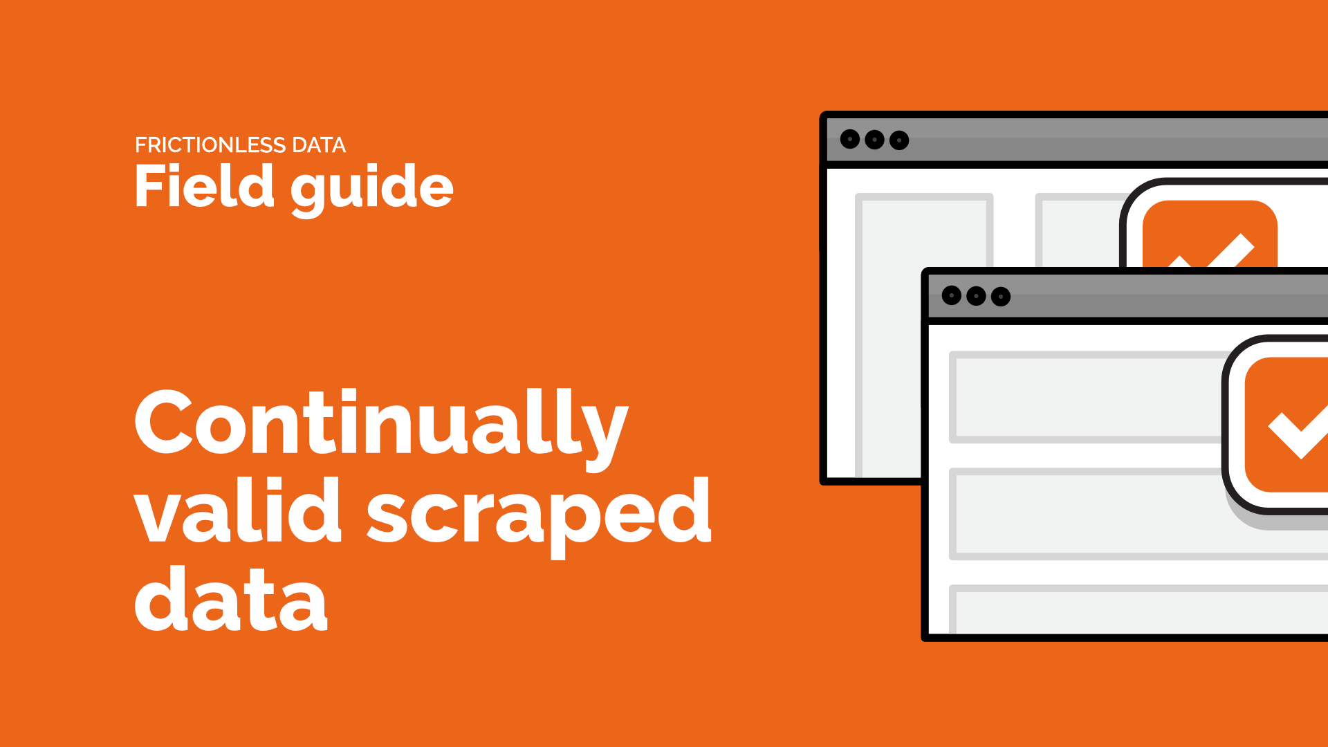
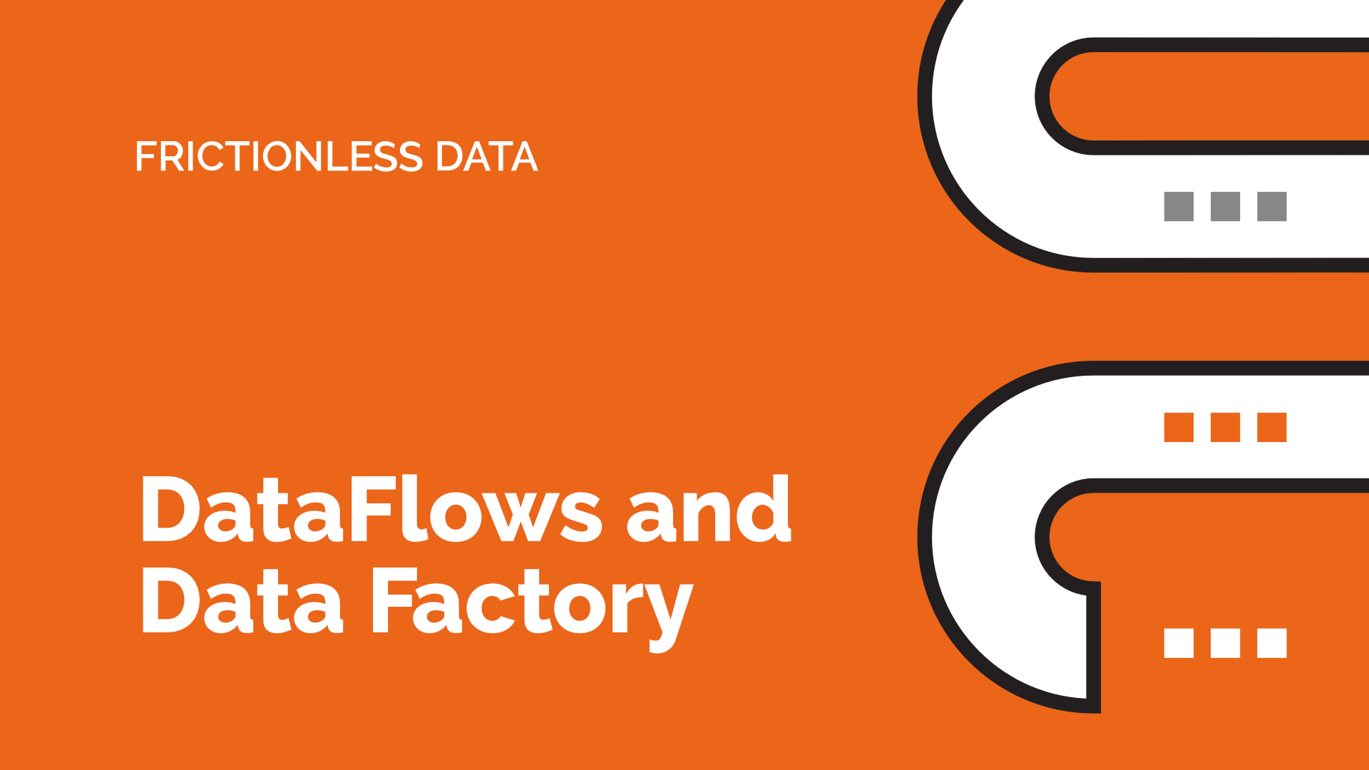
The Frictionless Data Field Guide was created with the intention of being a standalone resource, that could be used in isolation from the rest of the Frictionless Data content. It was given its own identity with this cover image, and a series of illustrations used throughout the guides pages, and in supporting videos.
With the exception of the video titles, all of this was delivered with a static site generator, which offered an easy route to publishing to GitHub pages. The result can be seen at mintcanary.com/frictionlessdata.
As lead designer for the project Sam’s attention to detail and ability to see the ‘big picture’ was essential for a complex project such as this and the ability for us to communicate complex information to multiple audiences though the website was a key factor to the overall success of the Frictionless Data.
Jo Barratt, Delivery Manager, Open Knowledge International.
Project roles
- Visual identity
- Web design
- Illustration
- Web build