Goodtables is an online tool, built by Open Knowledge International (OKI). OKI is a global non-profit organisation, playing an instrumental role in demonstrating the value of open data, and in building tools to facilitate its use. The function of the Goodtables application is to validate tabular data, on a continuous basis. It does this by checking against various criteria, such as "do all rows have the same number of columns?".
When I joined this project there was a rough, but working prototype. This was great for understanding the function of this app, which was attempting to do something completely new. It was clear though that there were some significant challenges ahead. The information presented to the user could be confusing or overwhelming. This was due to the quantity, but also its alien nature, when presented out of context. There was also an unresolved need to manage and navigate datasets. The application needed a visual identity, and needed to be introduced to potential new users.

As the product is based around continually monitoring data, and aiding the transition from bad quality data to good quality data, the visual identity was designed to evoke these themes of continuation and transition. Continuation is represented by the "G" in the logo icon, taking the form of a cyclical arrow.
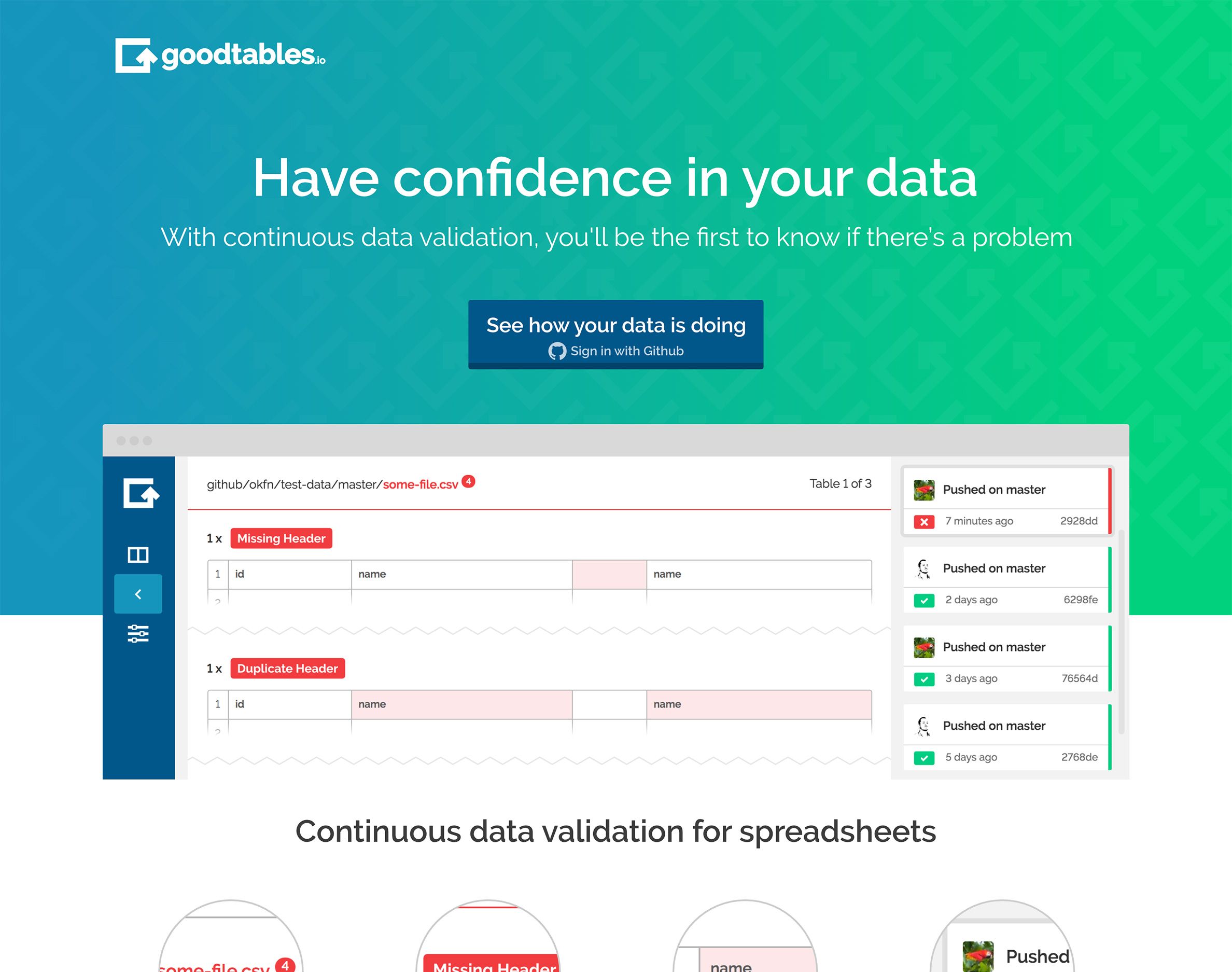
The gradient used on the landing page banner represents the transition. The resulting green is echoed in the screenshot below it, as is the transition from errors to no errors.
Most the work for this project however was in the designing and building of the application interface.
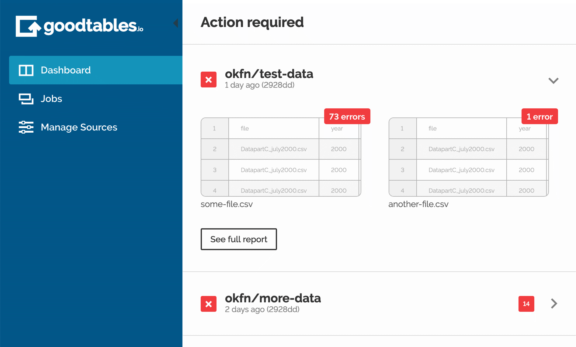
The dashboard was designed to focus the user's attention on items that needs attention. While further information about ongoing validations is available, the user can ignore it, secure in the knowledge that all the critical stuff can be found in one place. Errors feature a preview of the problematic file, to give some context at a glance, before clicking through to a full report.
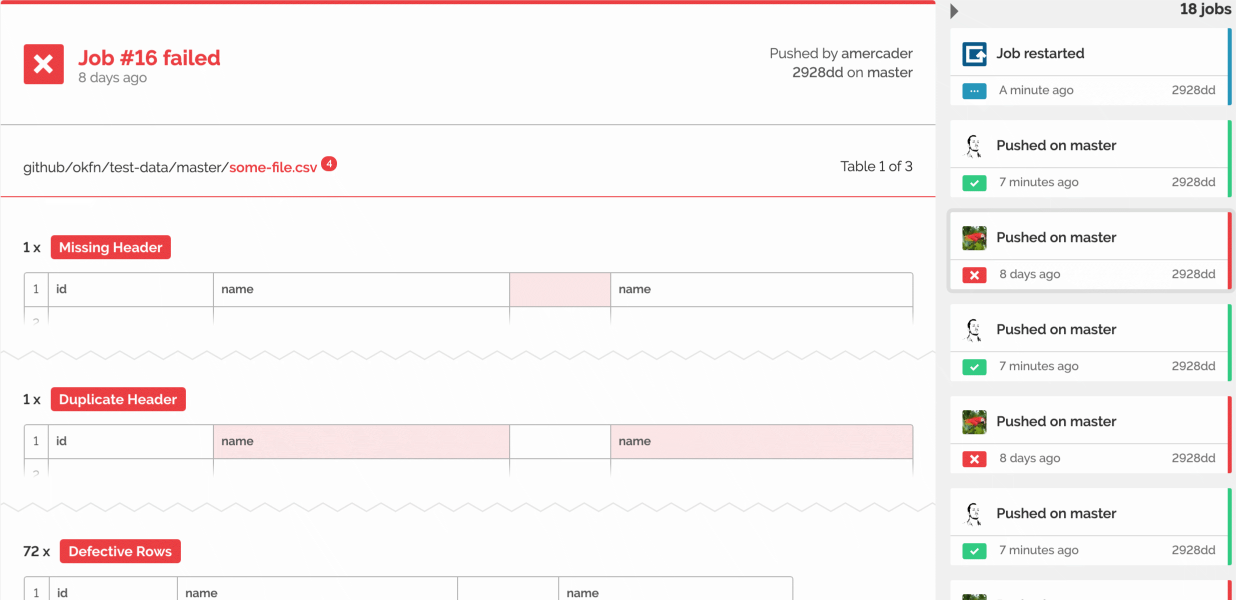
The biggest challenge of the report view was reducing the amount of content presented to the user, in way that still provided context. This was achieved by presenting the problematic sections of a data table, in a recognisable table form.
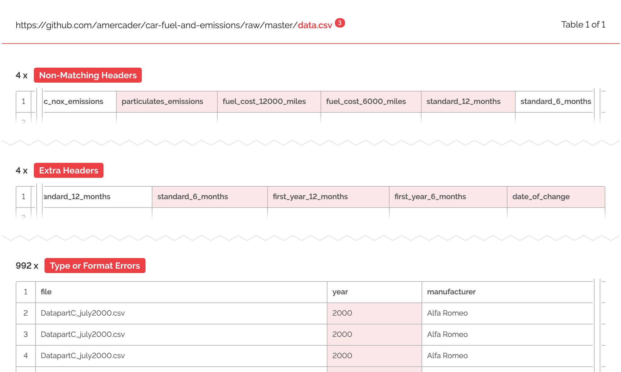
To do this with larger tables meant truncating them, again retaining enough data and visual information for the preview to be meaningful.
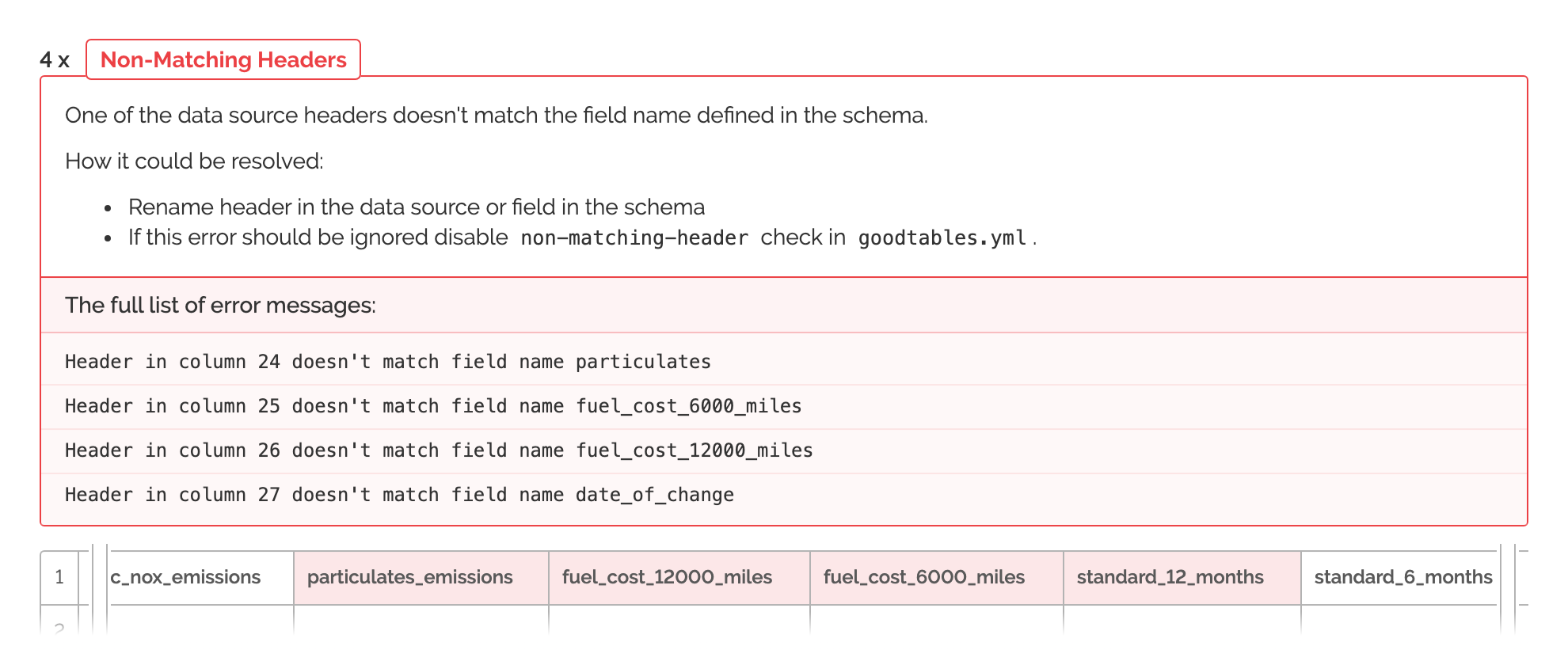
In each case, individual error messages can be expanded to reveal further details, and advice on how to resolve the issue.
These designs were delivered as high-fidelity prototypes. Built in a Vue.js based static site generator (Nuxt) to create highest possible portability to the final product, which was also to be built using Vue. The designs were merged into production by OKI developers, who also carried out user testing. Prototypes were then iterated on by myself, as required.
Sam led the branding of the application and developed the UX, bringing clarity and simplicity to a series of complex processes. Sam's solution in terms of managing multiple jobs and identifying errors for the user was innovative and elegant. Sam's support and leadership to the rest of the product team was invaluable.
Jo Barratt, Delivery Manager, Open Knowledge International.
Project roles
- Visual identity
- UI design
- Web design
- Front-end build