OpenSpending is a free, global platform to search, visualise and analyse public fiscal data. The platform is built by Open Knowledge International (OKI). OKI is a global non-profit organisation, playing an instrumental role in demonstrating the value of open data, and in building tools to facilitate its use.
OpenSpending started as a much smaller project, back in 2008, with the single focus of enabling UK citizens to see how their taxes were being spent. The project grew and evolved over time, becoming more faceted, and in the process becoming different things to different users. The decision was taken to break OpenSpending into several distinct tools. This process would involve separating and renaming the parts, but also creating brand new tools and workflows. As OpenSpending was an established project, with community engagement, we felt it important not to lose the notion of OpenSpending in the creation of these new tools. So, the challenges here were:
- Create visual identities for individual tools.
- Develop a shared visual language for the new and existing tools.
- Design and build interfaces for the new features.


A new OpenSpening logo was designed, along with logos for each of the new component tools. A shared palette of muted blues / grey unified the tools, while a unique accent colour was used to differentiate each.
- Standard grey#2a2d34
- Standard accent#32a6ba
- Viewer blue#3a99d9
- Packager green#2abb9c
- Explorer purple#7d4e92
- Yellow#f1ba22
- Alert red#d93d3a
- Light grey#e6e6e6
A typeface was selected to compliment the new logos, but above all else to be readable in a variety of situations.
An icon style was developed, and bespoke icons created. The consistent use of our colour palette, fonts, and icon style made for a coherent look and feel across the suite of tools.
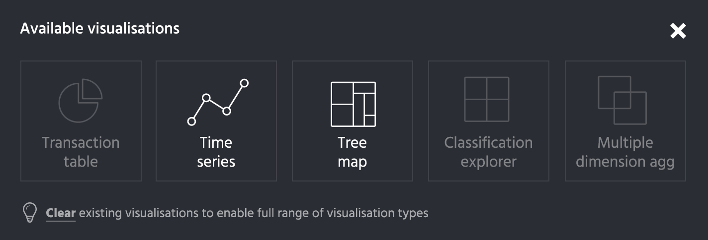
One of the more challenging and interesting pieces of interface design was the one to facilitate data package creation. A data package is essentially a container format used to describe and package a collection of data. In this tool, OS Packager, the user needed to be able to assign meta data to columns in one or more data tables. Early prototypes showed that this process could get confusing and overwhelming for the user. The keys to improving this user experience were:
- to make a clear visual link to the data that the user is familiar with
- to break the task into manageable chunks
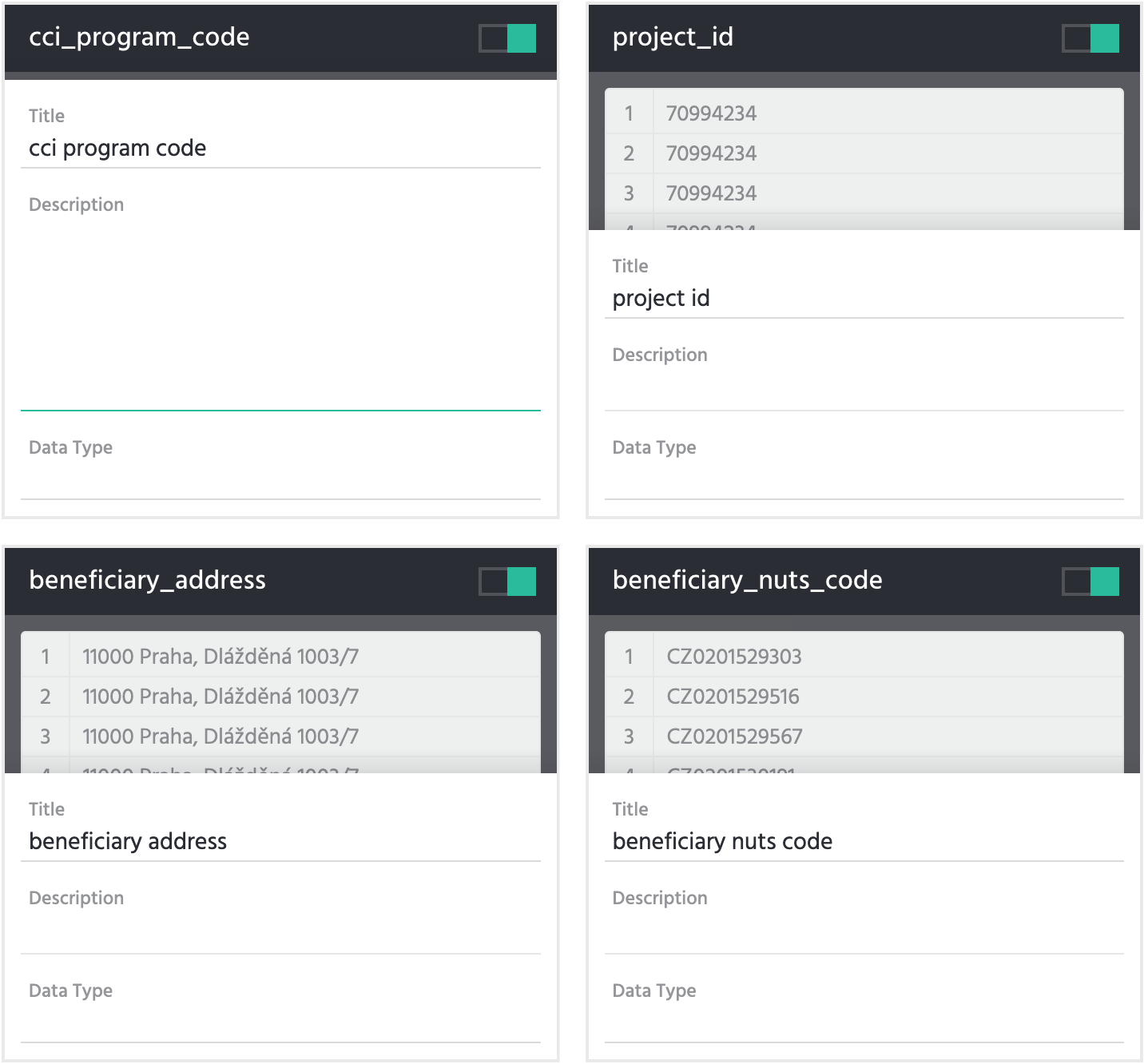
The adding of data would be relatively straight forward, a few form fields. The challenge lay in helping the user to recognise those columns from the tables they originated. We used a range of typical spreadsheets that might end up being fed into the app. The samples were often not predictably or uniformly structured, meaning it was not always obvious what you’re looking at. Take them out of the familiar context of the application they were created in, and this problem could get worse. For this reason, just pulling a table header is probably not sufficient to identify a column. We wanted to provide a preview of the data, to give the best chance of it being recognisable. In addition to this, I felt it important to keep the layout as close as possible to that of say Excel. The simplest solution would be to take the first few rows of the table, and put a form under each column, for the user to add their metadata.
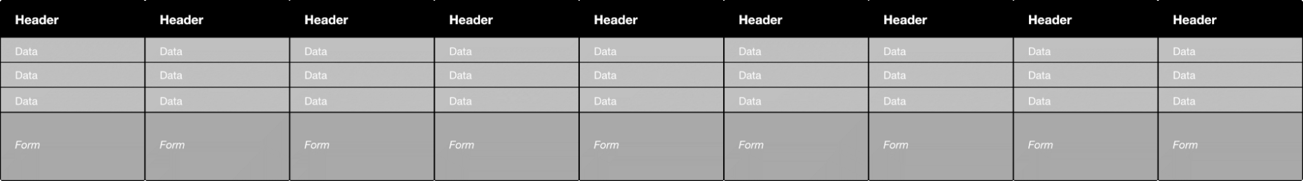
The obvious problem of course is that this could extend well beyond the edge of the users screen, leading to an awkward navigating experience. For an app aimed at desktop users, horizontal scrolling was undesirable.
Playing to the strengths of the medium, the next step was to make the "columns" wrap. The layout then needed some vertical spacing where this new line occurs, to make it clear that one column is separate from the one above it; and horizontal spacing to prevent the false impression of grouping created by the rows.
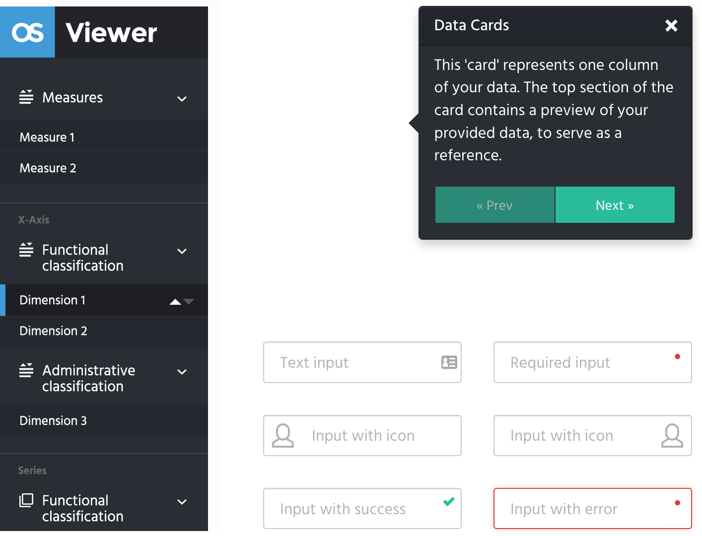
The solution that emerged was what I call the data-card.
All interface designs were delivered as high-fidelity prototypes.
The re-imaging of OpenSpending into a set of modular components was a challenging product decision, driven by the use of the platform by a range of civic tech and government actors with varying use cases and implementation constraints. Sam's design and user experience work embraced these challenges, resulting in a minimal and consistent look and feel across the various components, and ensured a sense of continuity as users moved across different aspects of the system, depending on their particular usage patterns.
Paul Walsh, Chief Product Officer, Open Knowledge International.
The data cards approach is a particularly suitable response to a challenging user experience problem, where users need to provide a large amount of contextual information about data in a file, and be guided through this without too much upfront complexity. The resulting design and user experience of OpenSpending has met the use cases that have been targeted, and in particular, have enabled non-technical users to perform highly technical tasks with large files of fiscal data.
Paul Walsh, Chief Product Officer, Open Knowledge International.
Project roles
- Visual identity
- UI design
- Web design
- Front-end build