Rethink is a personal project, exploring the idea of challenging norms and shifting societal perceptions. Rethink Utopia is specifically focused on the seeming societal trend towards preserving our ways of life, at the expense of imagining better futures. The work uses, and questions the medium of advertising.
The outcome of this work has been a series of pseudo-ads. The ads are designed to first capture attention, by playing with the medium in which they are presented. The second objective is to provoke thought about the value and cost of the products and services which are so often king of such advertisements. This is achieved by juxtaposing some of the more dystopian realities of our time.
The first incarnation of this juxtaposition idea was a play on the marketing mantra "think outside the box". Inviting the viewer to consider what is outside of the frame of the advertisement.
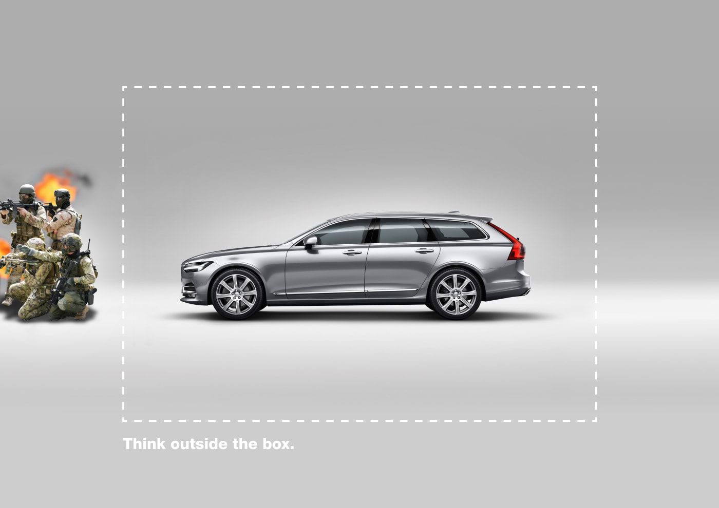
This lead me to think about infinity walls, used by photographers to achieve this clean, isolated look. What if instead of the reality of the photographer's studio being hidden, it was the less attractive aspects of society.
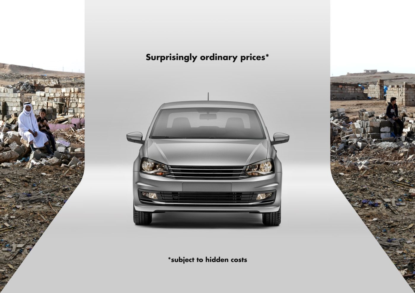
I felt this was working better, with the point less easy to miss. The questioning of the difference between price and cost, which is introduced here, I thought was a powerful device. I applied this concept to a second product.
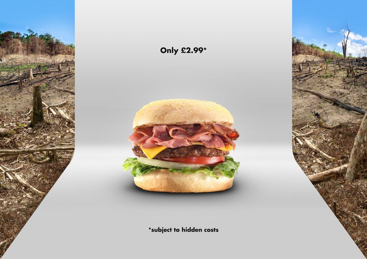
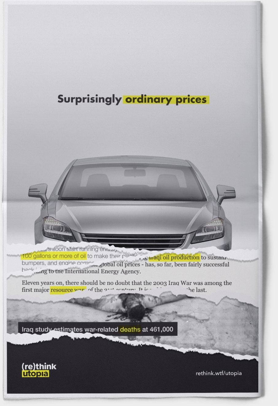
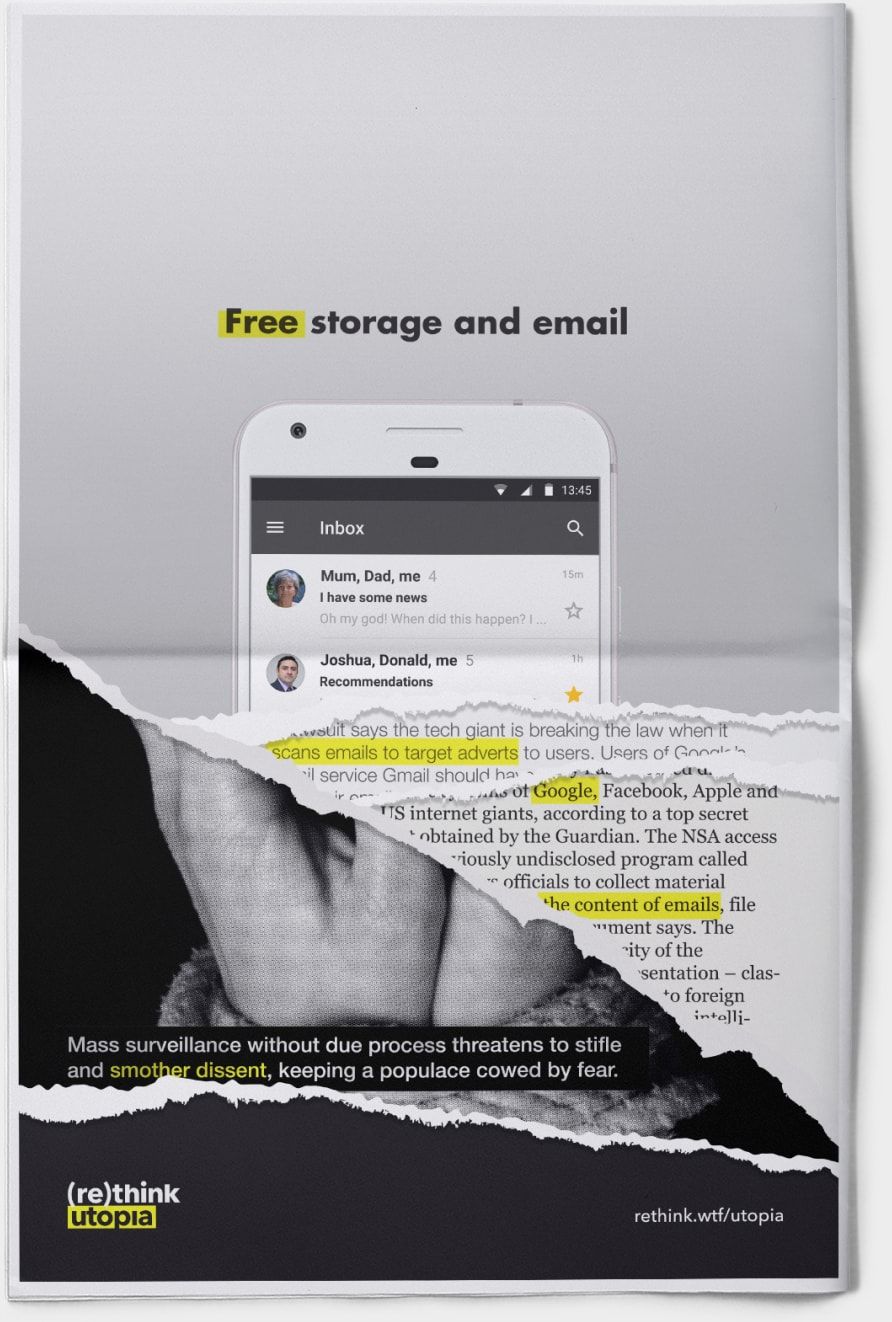
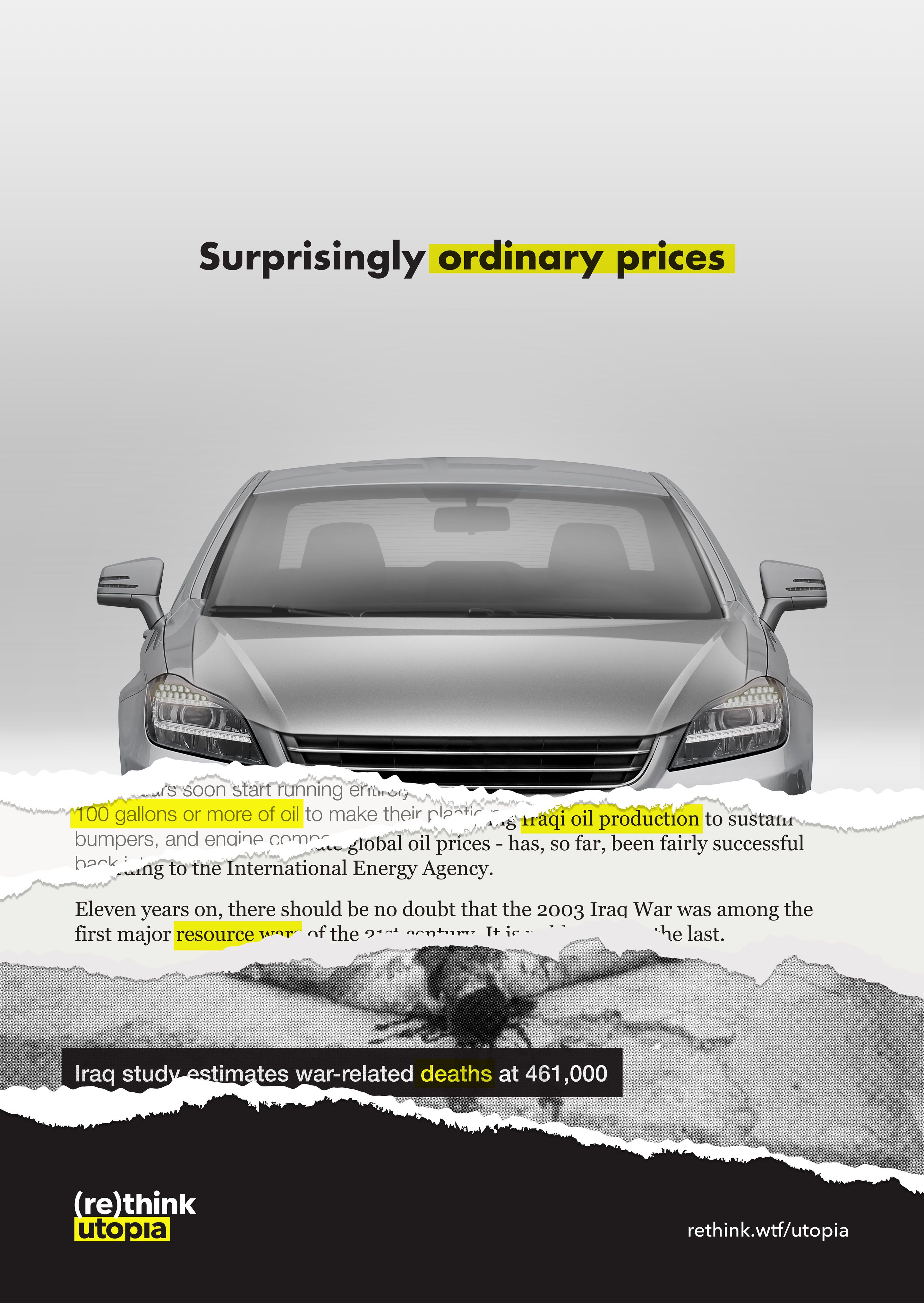
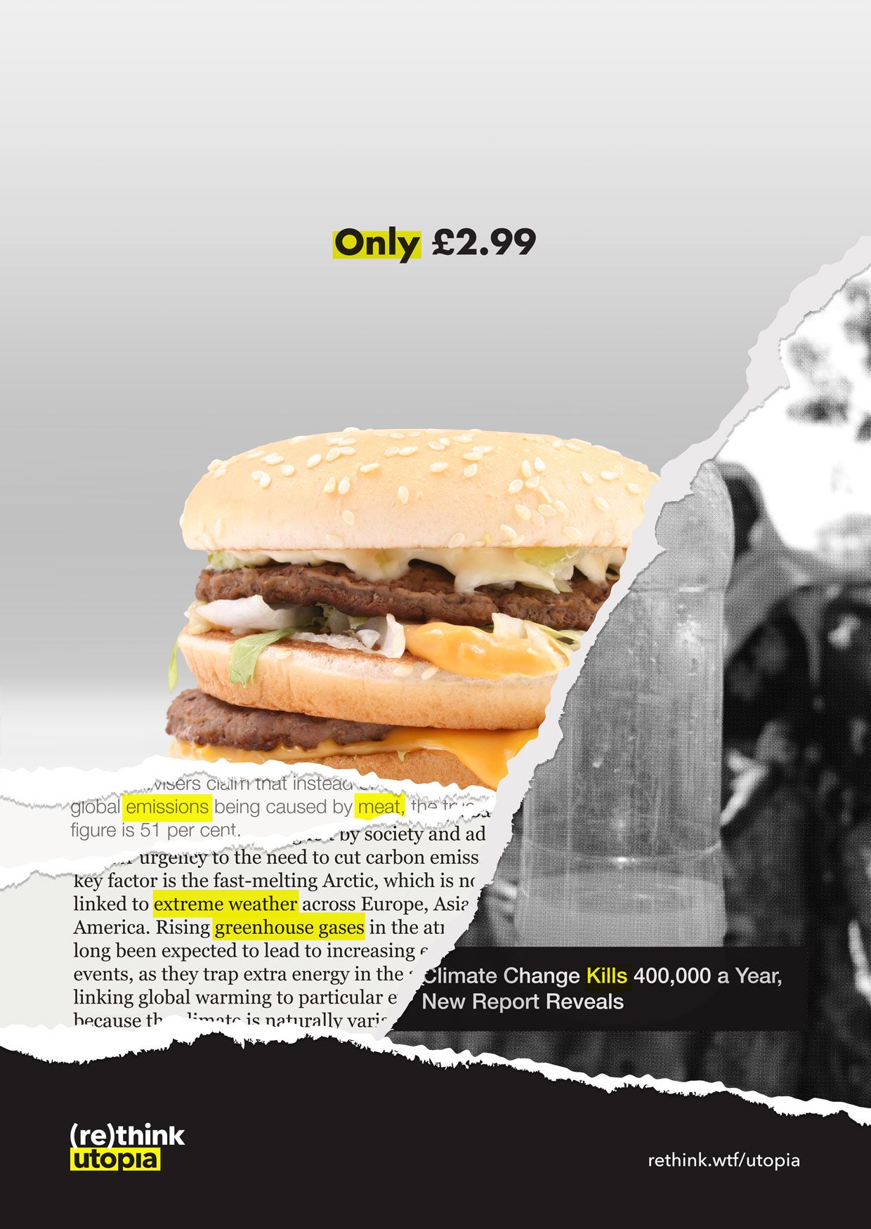
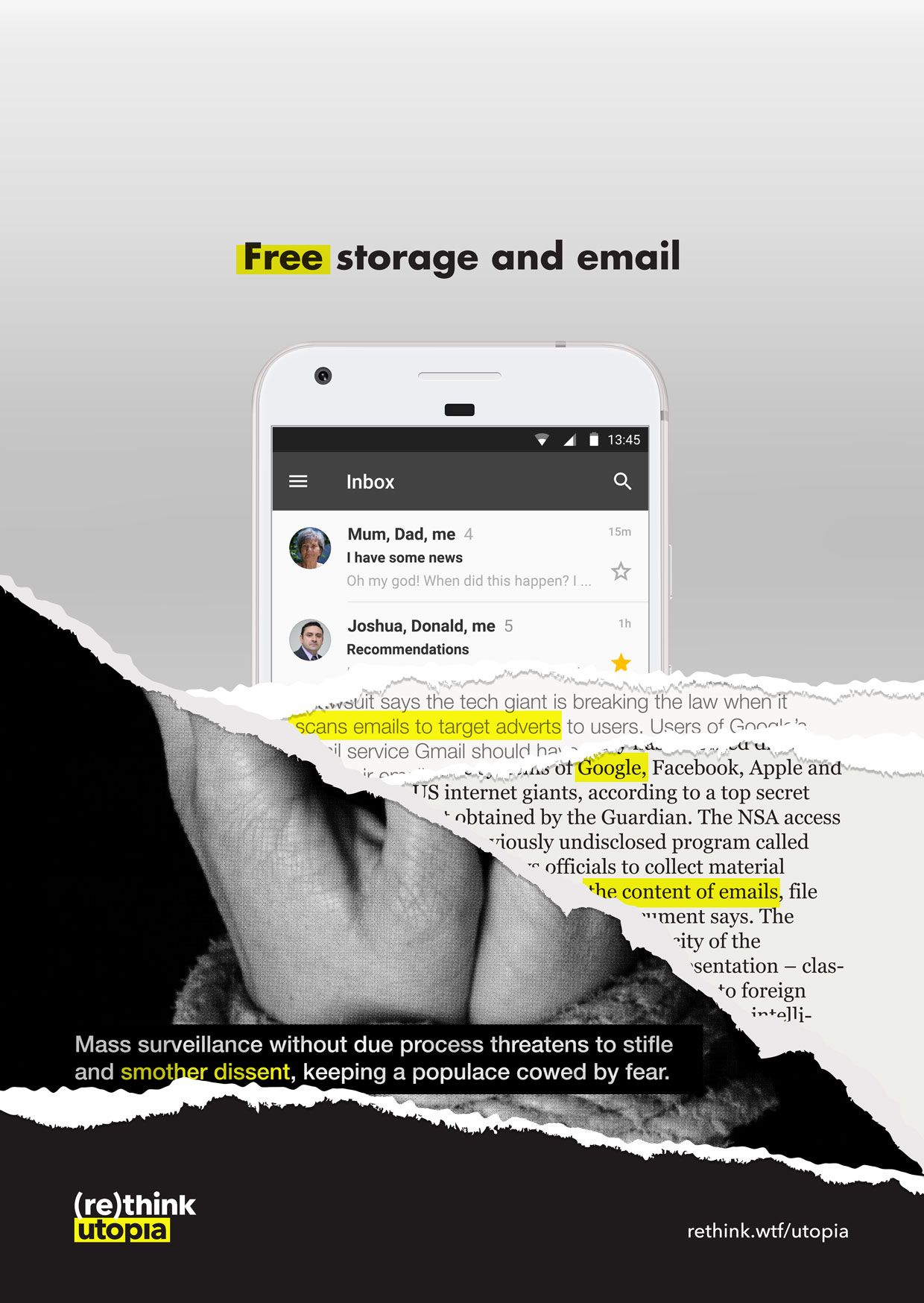
The implicit message here is that part of the cost of a car is the devastation of the wars in pursuit of the oil required; and part of the cost of a burger is the deforestation required for the meat industry. Feedback suggested however that this message was being lost. To make the message more explicit, I began introducing some newspaper headlines. I moved away from the framing of an advert, to the hacking of one. I wanted something that would resonate with the medium, so rather than a computer hack aesthetic, I went for a torn page effect. This, like a computer hack, disrupts the content, undermines its perceived strength, and provides space for an alternative message.
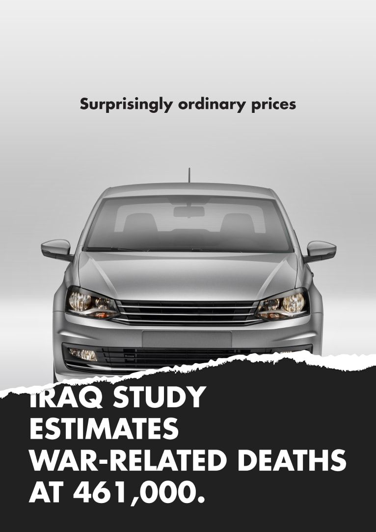
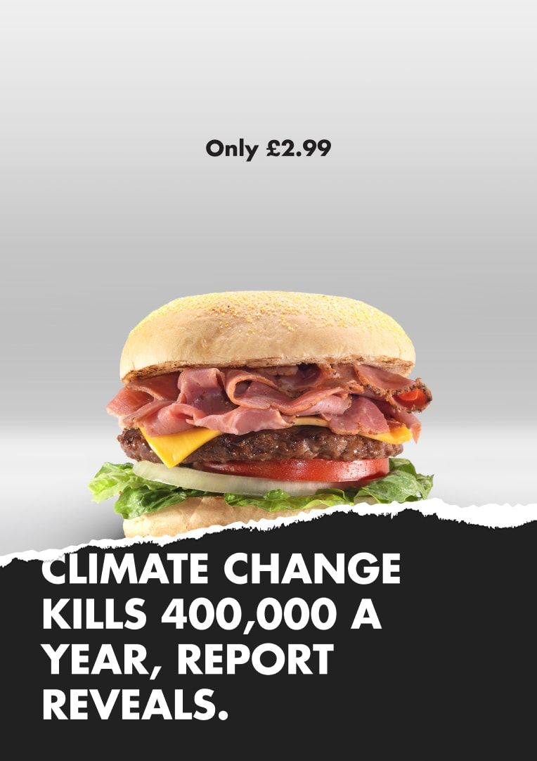
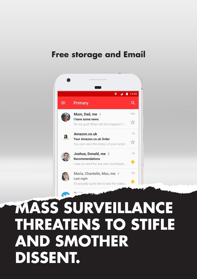
Feedback to this set of images suggested that the relationship between the "ad" and the headline was not clear enough, with the assumption that there was no relationship at all. Concussing that the leap between the two, e.g car to war, was too great, I decided to fill in some of the gaps. The next iteration added some snippets of news articles, and also reintroduced the juxtaposed imagery. This now takes the form of a composite image, created from the faux ad and a revealed image "beneath" it.
This work is perhaps primarily an exercise in finding the balance between providing complete information, and leaving enough work for the viewer to find the experience engaging.
Project roles
- Ideation
- Logo design
- Visual identity
- Print design