SMTH is predominately a blog, featuring my writing about topics in and around design and digital media. The site is also intended to provide a home for any other web content that I might create. For example, photography, or perhaps social media.
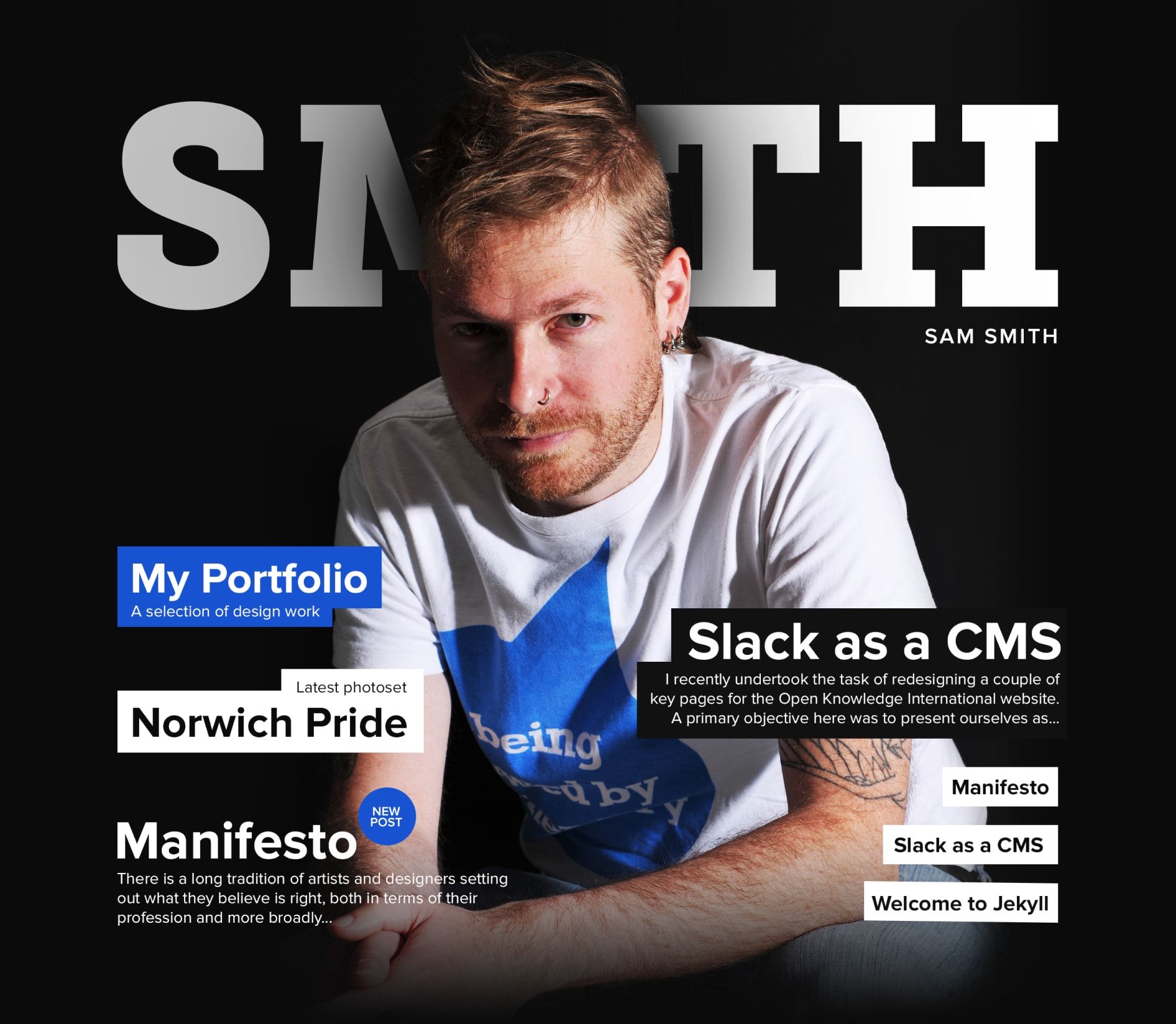
Given the the subject matter and intention of the site, I wanted the design to do something a little different than a typical blog design. Creating a home page that mimicked a magazine cover I felt was an interesting challenge; this also lent itself to me being able to make light of the self-serving nature of this site, by putting myself on the "cover".
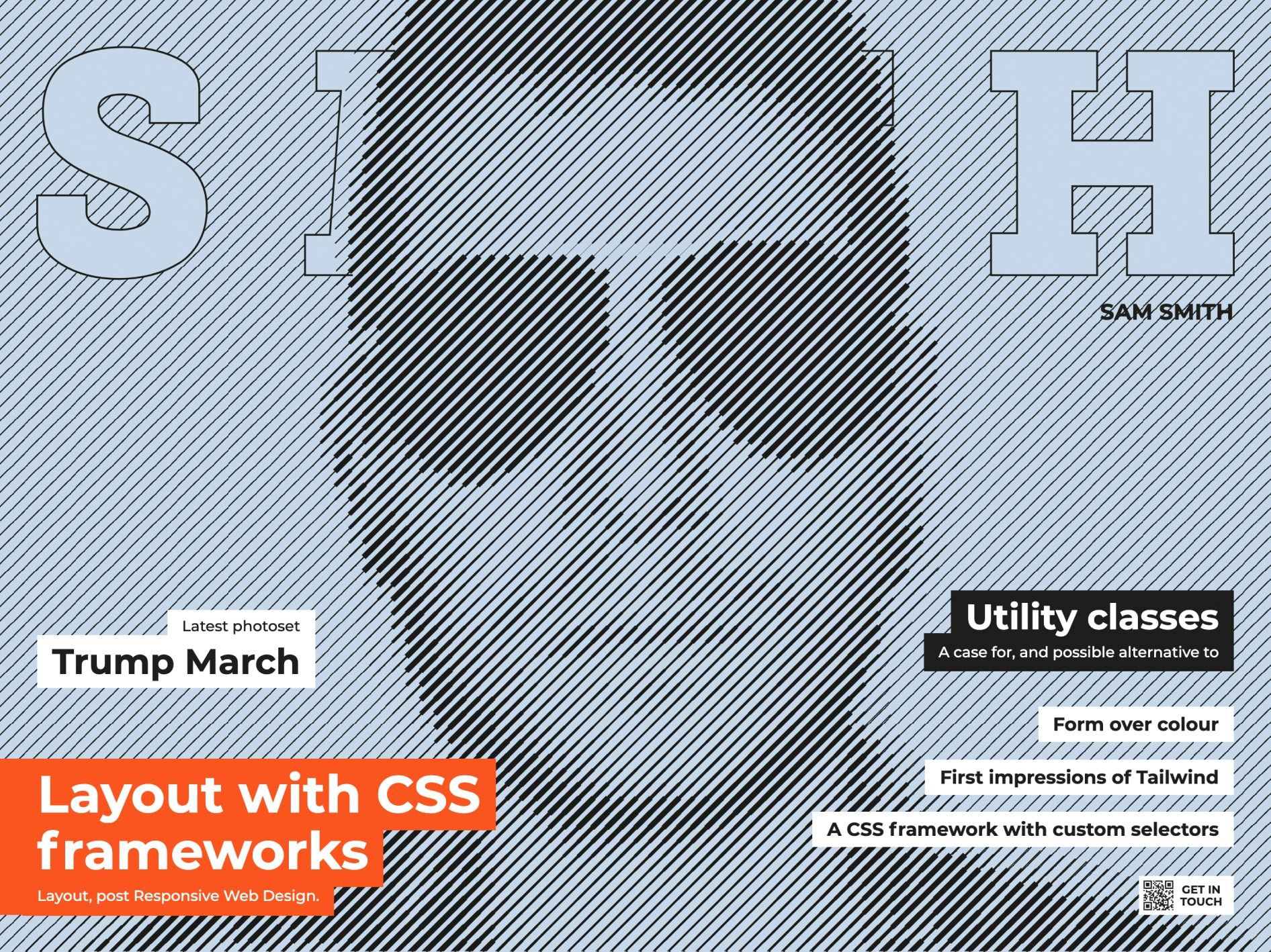
Much like a magazine, the cover changes over time. It evolved into a vehicle for illustration work.



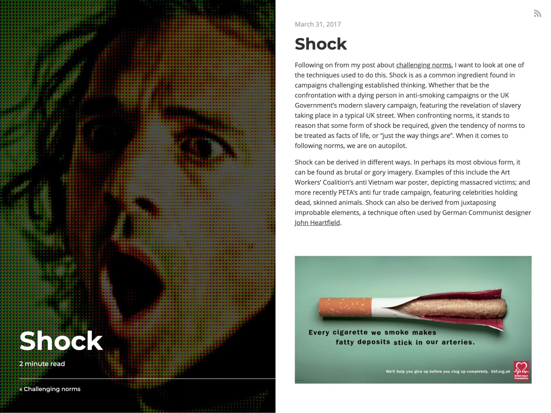
I wanted the theme continues on the post / article pages. Initially these pages resembled a double page spread, with a feature image on one side and content on the other.
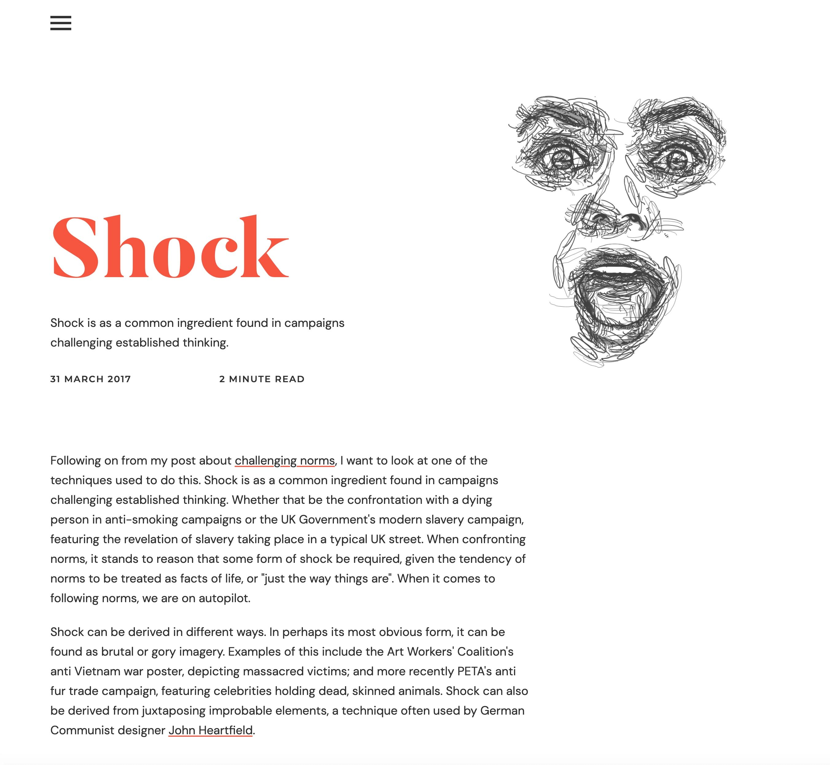
I found there to be something a little awkward about reading from the centre to the edge of the viewport, so eventually redesigned this page to be a little more conventional. I at this time started to create illustrations that did not need to bleed off the page.
The site is built using a static site generator, which currently converts markdown files to blog post pages, and pulls externally hosted photos from an API.
The site is a live work in progress.
Project roles
- Illustration
- Web design
- Web build