After switching to the design tool Adobe XD I was looking for a plugin that could generate typographic scales - a set of font sizes based on a desired ratio. When I couldn't find such a tool, I decided to make one.
This is a personal project, with myself as the primary user, but I felt that this tool could have a wider audience. That audience being other interface designers who use Adobe XD. Specifically they would likely have a particular interest in typography; and would probably want to get the tool, and get back to work as quickly as possible. With this in mind I also designed and built a simple website containing instructions and a link to download the plugin.
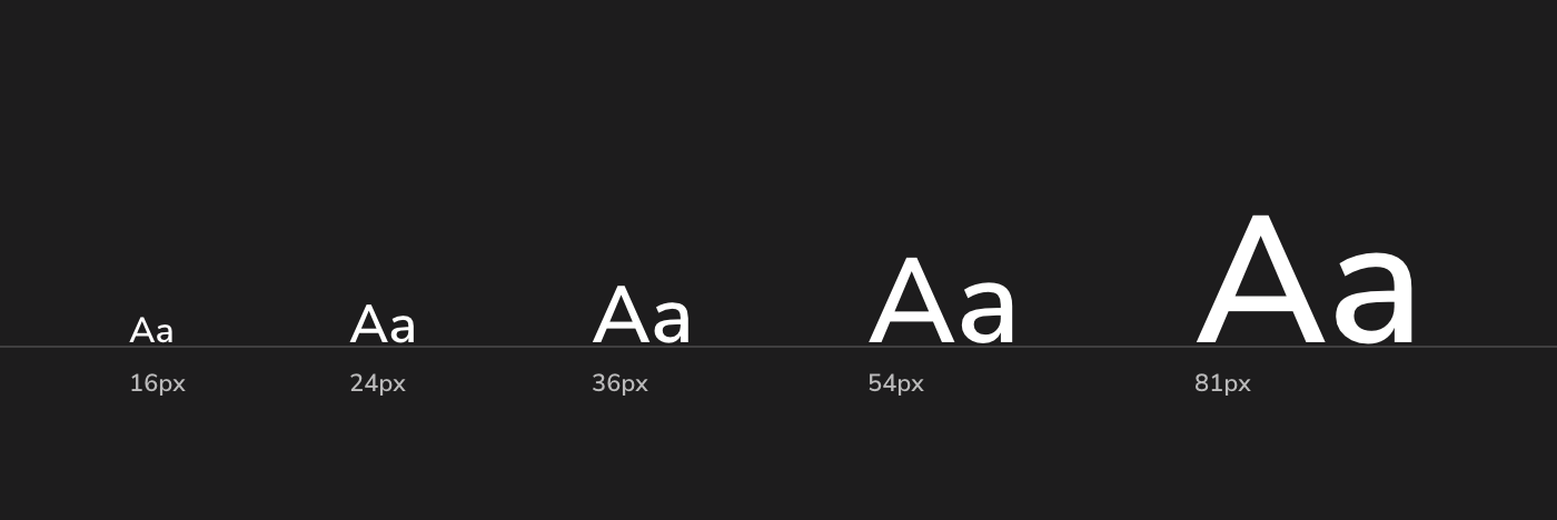
Creating a typographic scale is something that can be done manually, but in my view is a great candidate for automation. It's a combination of mathematics and duplication of objects. In a typical design tool, the end result would look something like this:
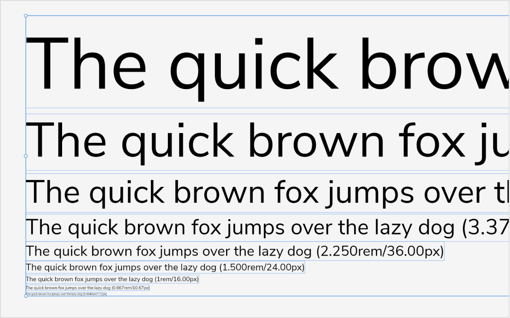
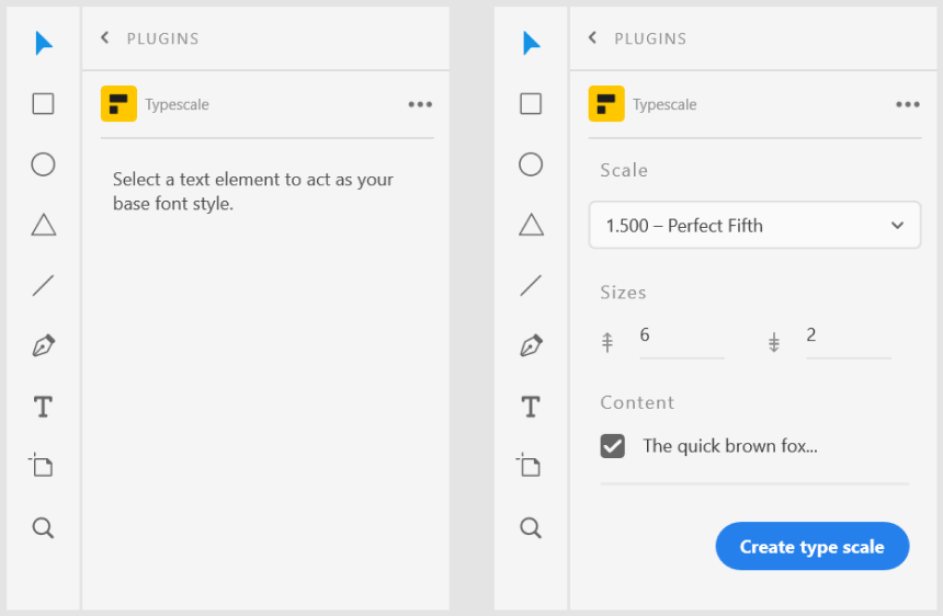
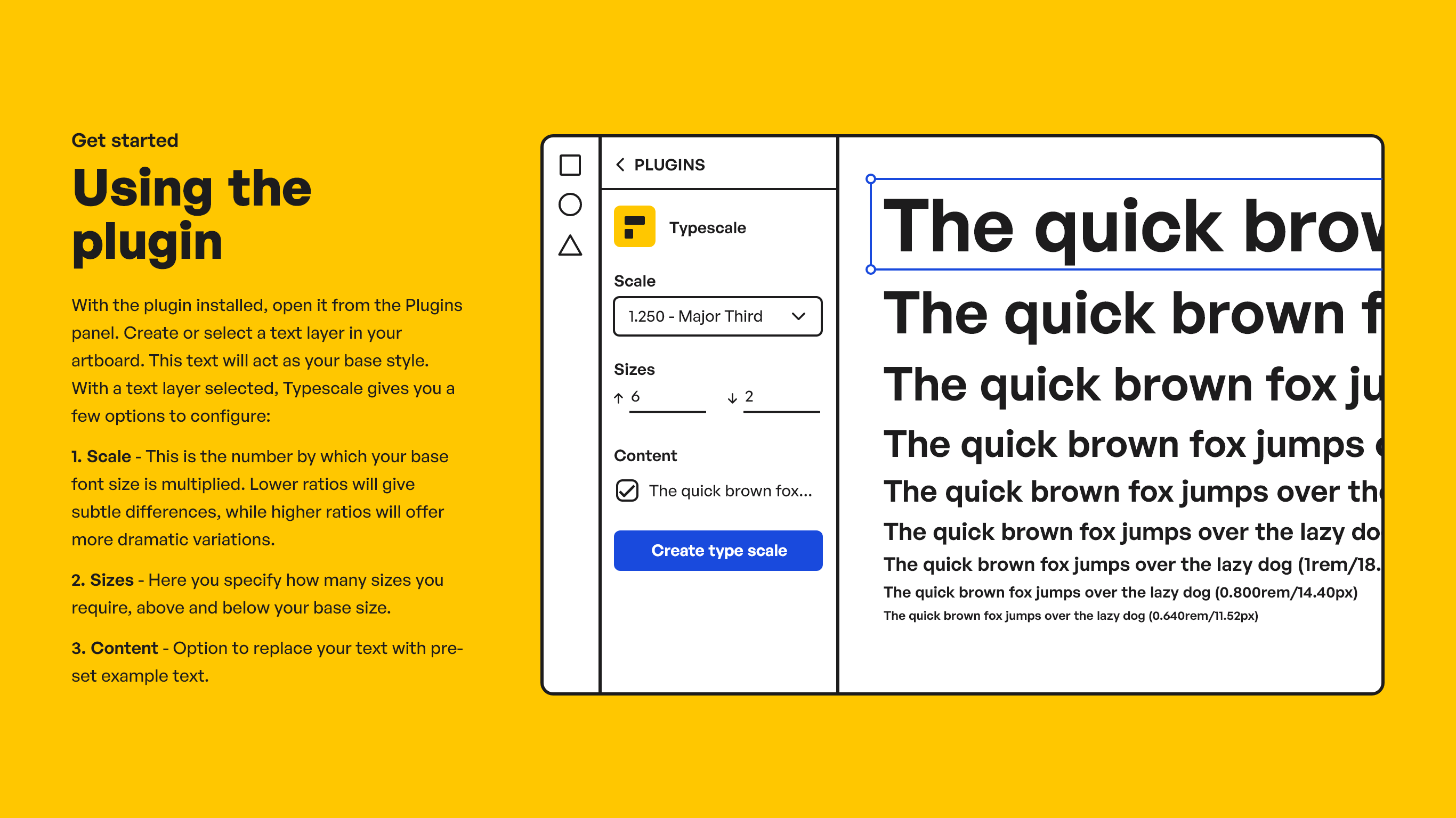
In my experience you usually know what your base font style is going to be at this point. What you want to generate are some variations on that, at different font sizes. Your scale can range from subtle to dramatic differences in font size. Along with the number of variations, the ratio needs to be configurable in any tool that's going to do this job. Here is the interface added to Adobe XD by my new plugin - Typescale.
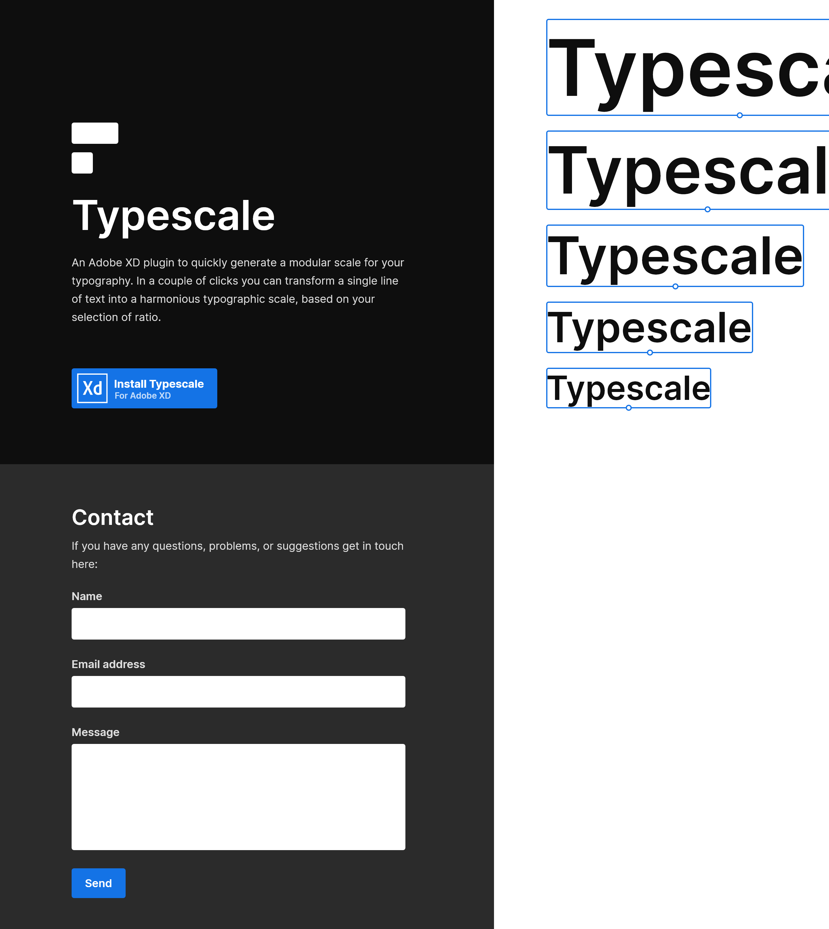
With the plugin working well, I turned my attention to the website. I started by producing a wireframe, containing what I thought were the essential elements. Those were a description of the product, some sort of visual representation of the product, a download link, and a means to get support and/or report problems.
I next started to play around with these elements, to get an idea of how the look and and feel could develop. I explored some colour palettes, and the utilitarian feel of the stylised interface.
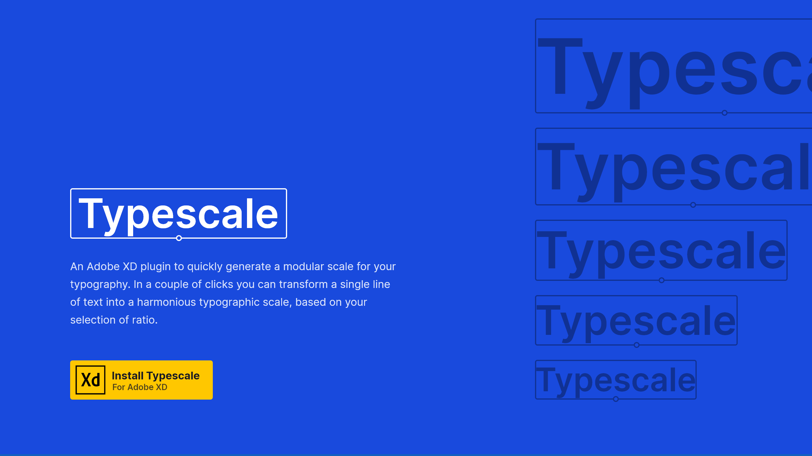
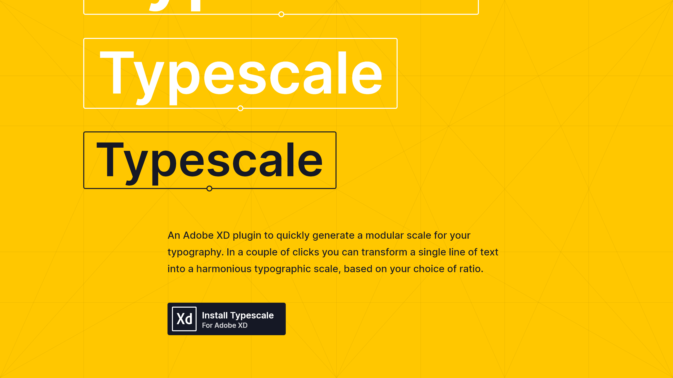
There were elements of these explorations that I liked, but I wasn't sure the direction was quite right for the user persona I had in mind. As this point I took a step back to consider typefaces. Creating the site for people with an interest in typography, I wanted something with a nod to the classic Helvetica, but also enough character to carry a typography heavy design. I came across General Sans from Indian Type Foundry, which I felt was a great fit and gave me a renewed sense of direction for the visual identity.

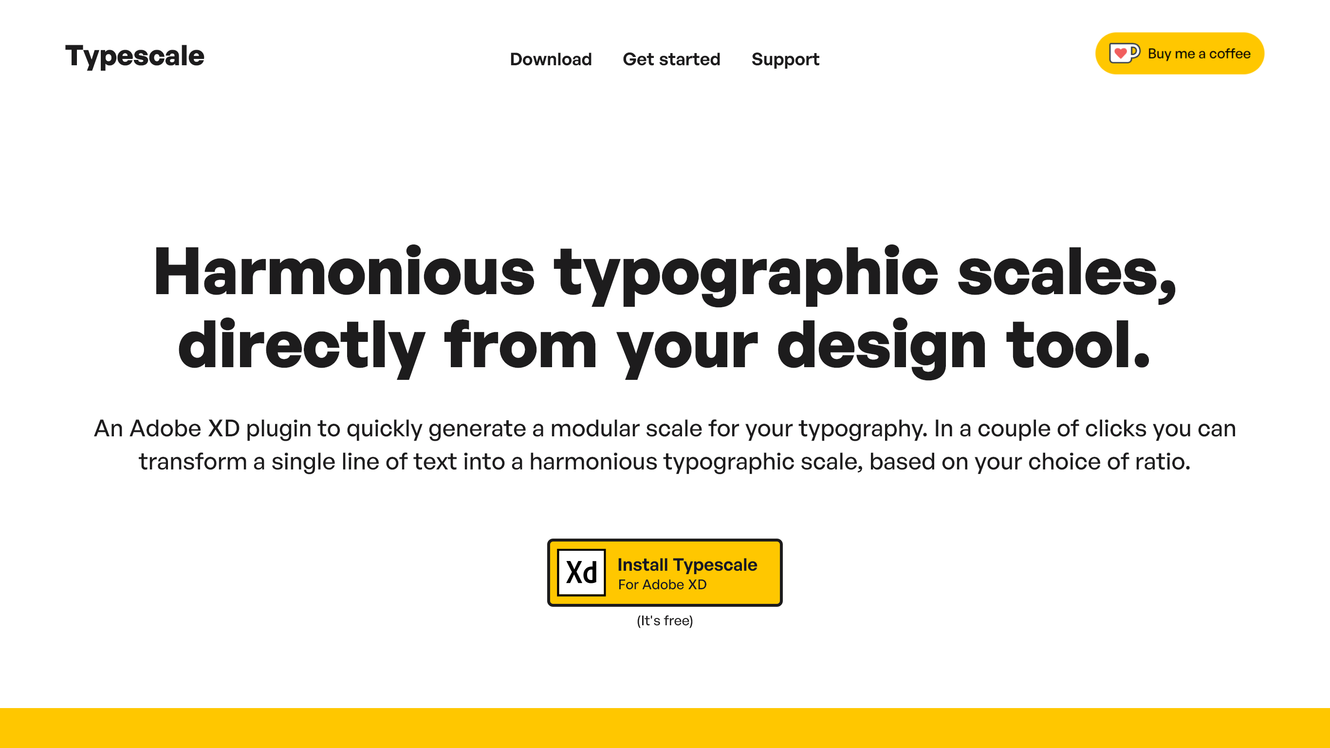
For the final pass at the website I reined in the design, producing something a little more traditional in terms of layout. With a value proposition added to the mix, the page now gets straight to the point. The addition of jump links help to make clear what content is available.
I expanded upon the stylised interface, developing it into a fuller representation of the plugin. Coupled with some instructional copy, this now serves both to give an overview of what the plugin does, as well as a quick start guide.
Below that comes the Support section, which remained largely as it was in the wireframe. The full web page can be found at typescale.io.
I really enjoy the Type Scale tools we have these days, this plugin is GOLDEN!
Typescale user.
Project roles
- Illustration
- Web design
- Web build